Portraiture | Your Point of View
Art Trends
Here’s looking at you, Kid
He was hard to miss. I was traveling and antiquing years ago north of Boston, in the incredibly quaint cobblestone village of Newburyport, MA when I stumbled upon an old red barn full of Antiques with the doors wide open. A treasure trove!
My find was an original, beautifully painted portrait of a pensive young gentleman, likely from the 1930’s, that just spoke to me. It seemed he had a story to tell; every time I look at the painting I wonder so he continues to engage. That my painting was only $40 was a score (!) and I later custom framed it in a design collection inspired by Brimfield for the world famous northeast Antique market. To this day, the portrait is one of my favorite artworks in my collection!
ART & DESIGN TRENDS | PORTRAITS ARE HAVING THEIR MOMENT
Long before selfies there was Portraiture. Portraits add such character to a room or Gallery Wall, and they are definitely having their moment in the Spotlight! It may be that the very texture and quality of an original artwork offers a sort of permanence and storytelling rich with quality in a stylish home. Curating portraits over time really adds an eclectic vibe to any art collective.
While designing Gallery Walls continues to be haute style, and art resources are so prolific, I see original portraits pop up everywhere! Artful living by design, indeed.
Pin-worthy Portraits offer an elegant, elevated or edgy look depending on your style or point of view. An original painting or intriguing portrait captures a moment in time with an abundance of character. And oh, the story’s they could tell- If Your Walls Could Talk!
Oversize Portraits
According to Pin-sights PINTEREST TOP 100
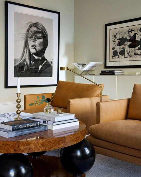
Wall art is big: Buh-bye, blank space! Large posters, works of art and especially photography prints are blowing up (saves for “big wall art” +637%) This is moving into large portrait photography as well.
Elegant, sophisticated and modern interior via @insideinteriorstories | Brigitte Bardot Photograph by Terry O’Neill
HERE’S LOOKING AT YOU
I love how Artfully Walls uses a consistent Gallery Wall formula, always beginning with Portraits. I’ve long admired Michelle Adams, Editor of their Artful Review and co-founder of Lonny, a trailblazer in the online-shelter-magazine category, as well as domino magazine’s editor in chief. So it’s no surprise the Artful Review is one of my favorite art resources!
For tips and tricks when decorating with art - This recommendation works consistently in styling beautiful gallery wall or salon wall displays of art. AW recently shared these design tips with the Design Community and IVY. From my own design experience, I find this GALLERY WALL // DESIGN RECIPE to be perfectly on point!
Gallery Wall // Design Recipe
Start with a Portrait (personal or a favored pet or animal) then add:
1 Photo
1 Oil or Acrylic
1 Graphic or Geometric Print
1 Landscape
Tie all items together with a common denominator by color palette and/or artful style
Generally, there is better balance when larger pieces are hung on the left. In general, it’s been said that when heavier pieces are on the left, not in the center or the right, more colorful, signature items work well on the right.
“An interior designer must be able to clarify (his) intent keeping ever in mind that decorating is not a look, it’s a POINT OF VIEW.” ”
Photography Design | Emily Henderson
// MID-CENTURY MODERN MIX //
Studio McGee
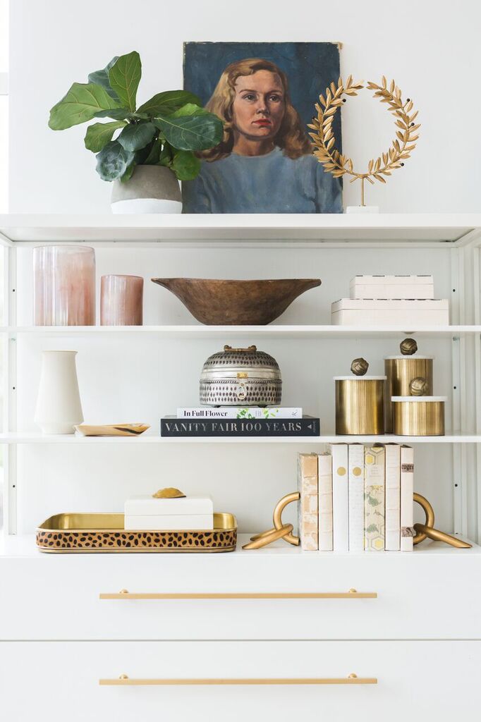
// STYLISH SHELVES & VIGNETTES //
A welcome addition to your home, original painted Portraits are storied with character and charm
// WALLS OPTIONAL //
Photograph Design | HGTV Leanne Ford placing vintage portraits face up on the coffee table — inspired!
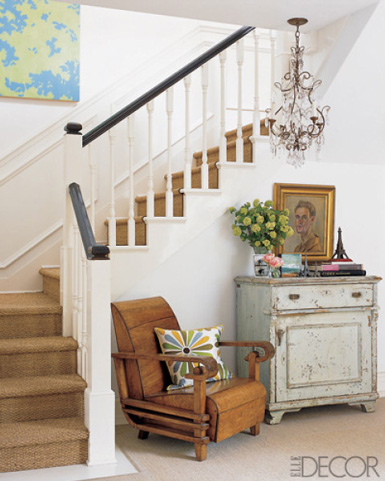
// SALON STAIRS //
Savannah Magazine
// CURATED COOL //
@LookLingerLove
// PICTURE THIS MODERN LIGHTING //
Shaun Smith | House Beautiful
Shaun Smith | House Beautiful
Create Your Own Portrait Gallery
I believe art that is meaningful to us makes for the best mementos, especially from your travels!
Here, my husband captured my idea of bike culture while biking the grounds at the Palace of Versailles. The glorious fall day was stunning and the absolute joy I felt bike riding in Paris was a memory I’ll never forget.
The artisans of Gallery Moments recreated my photograph into an original art painting, to make the moment last. I’d say that’s Artful Living, by Design.
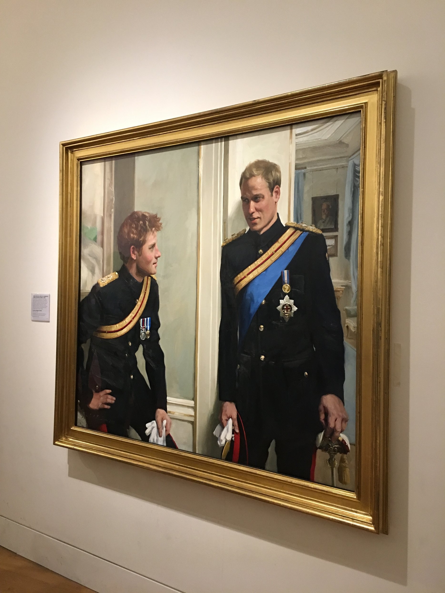
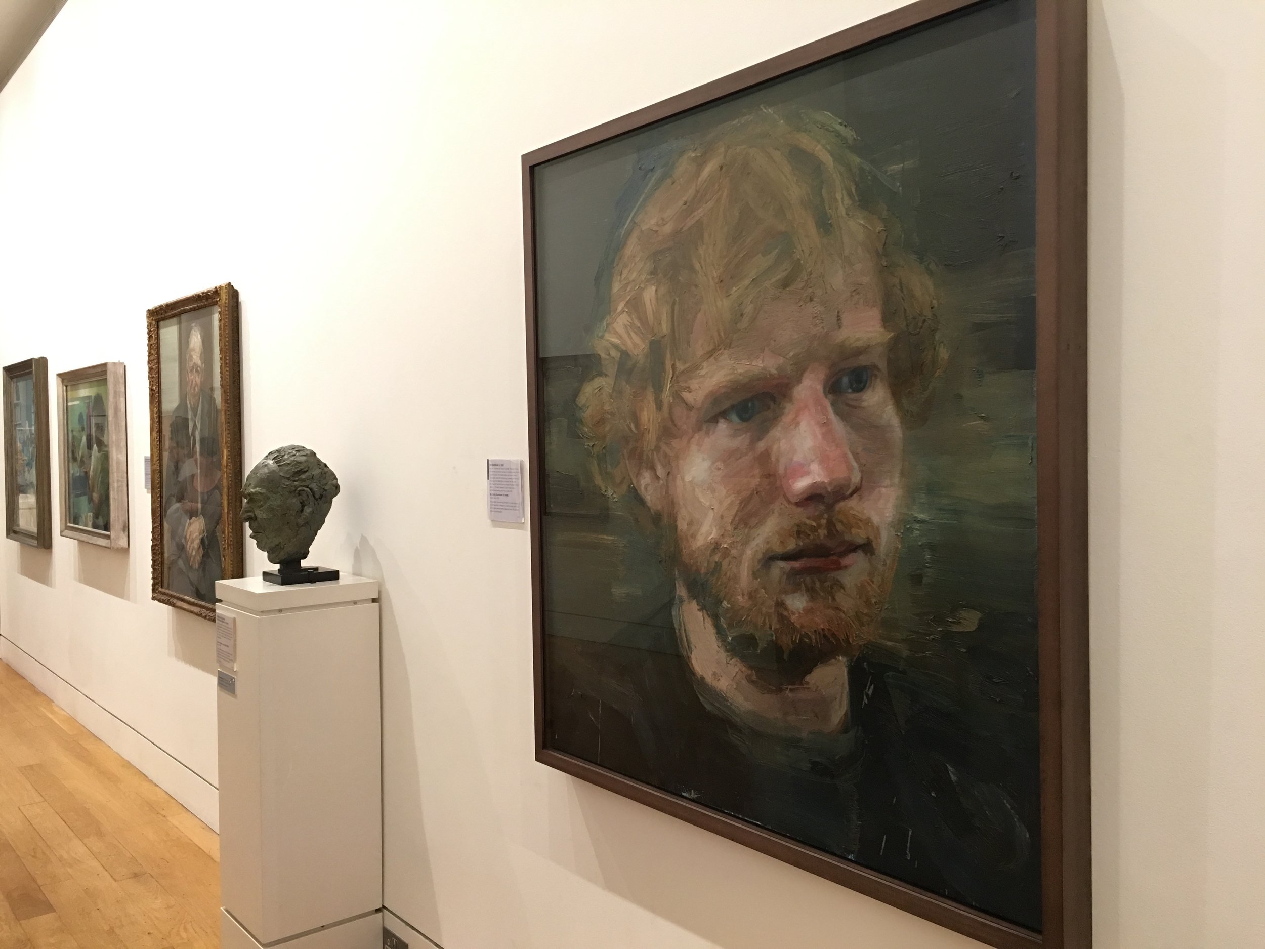
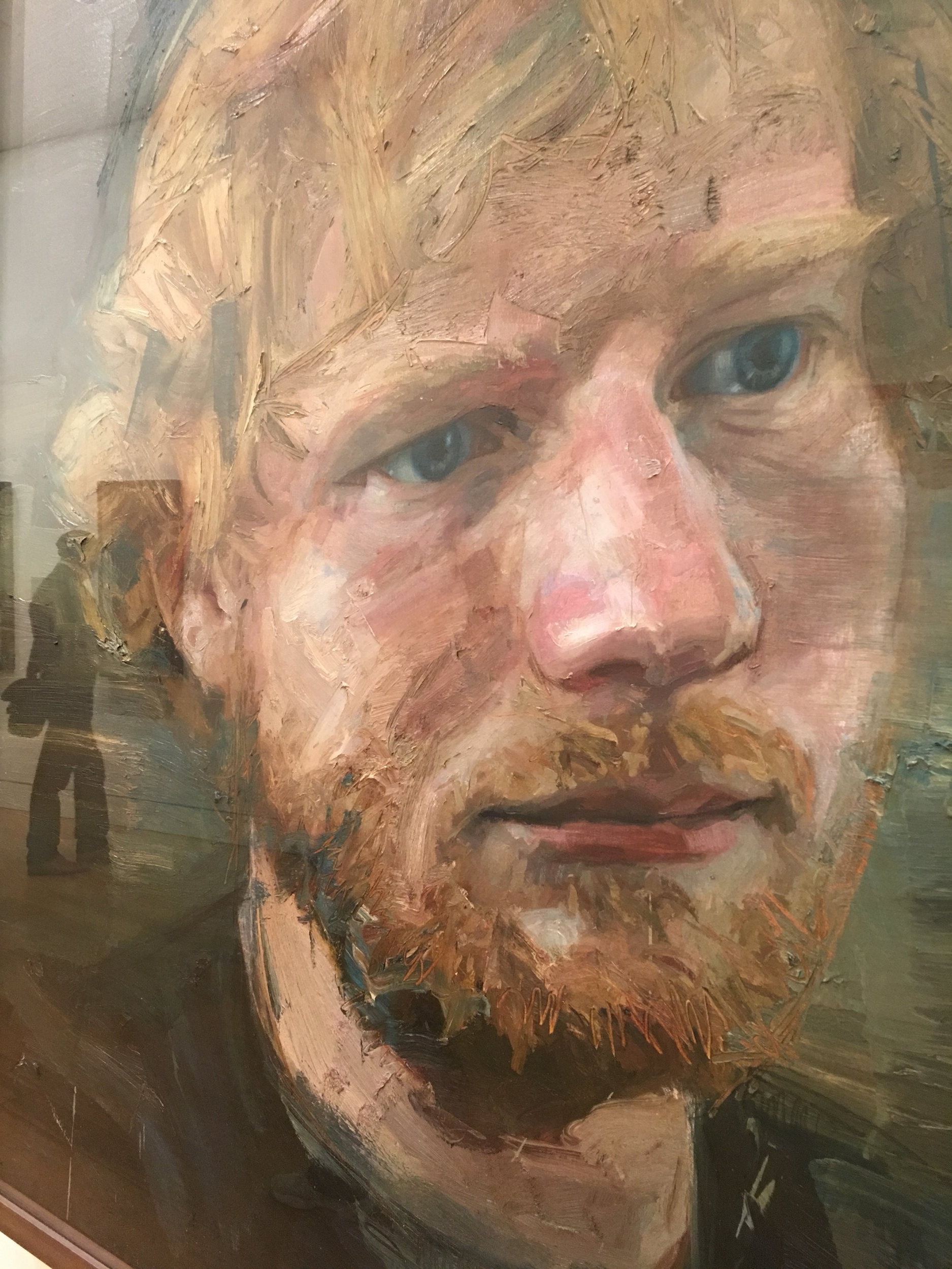
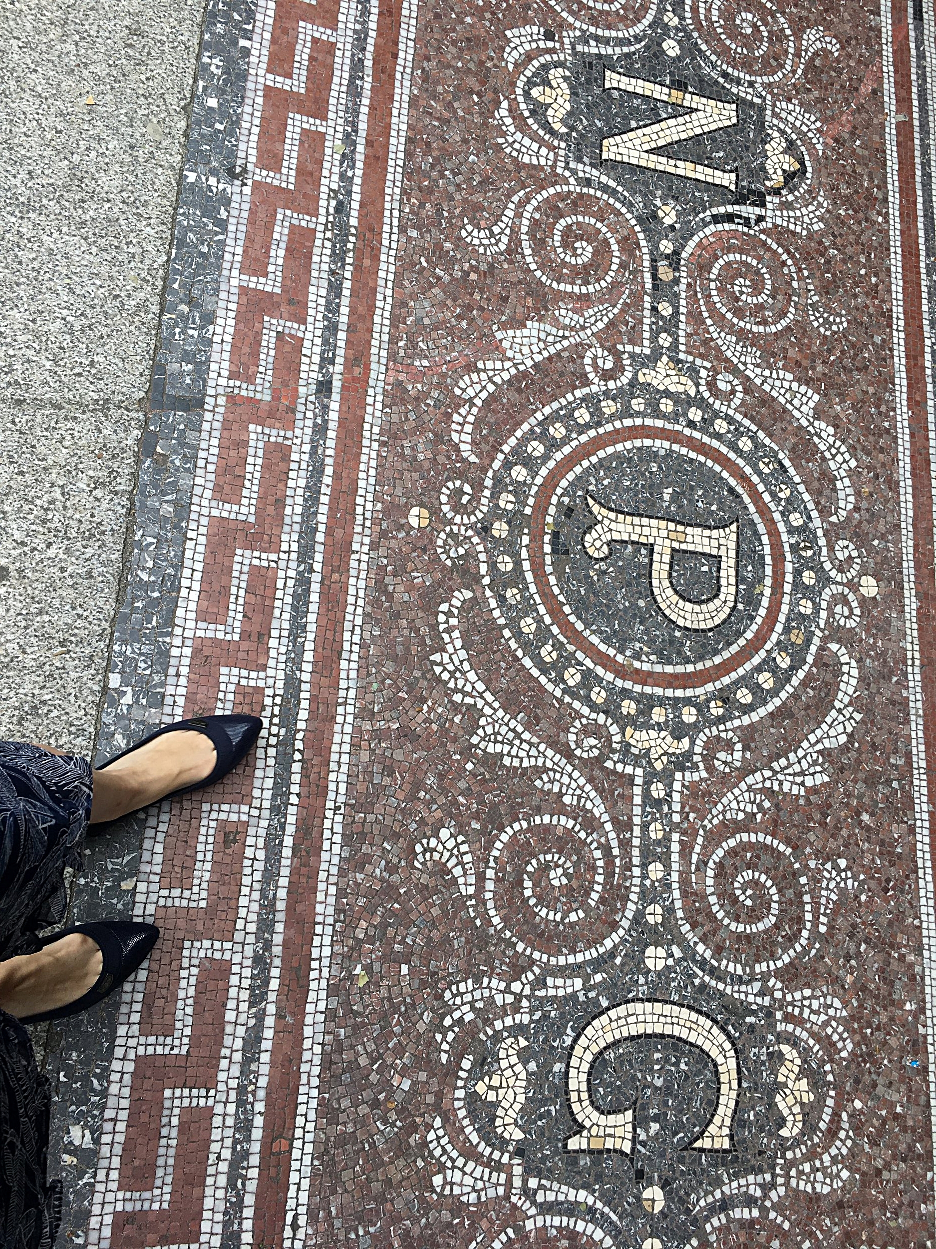
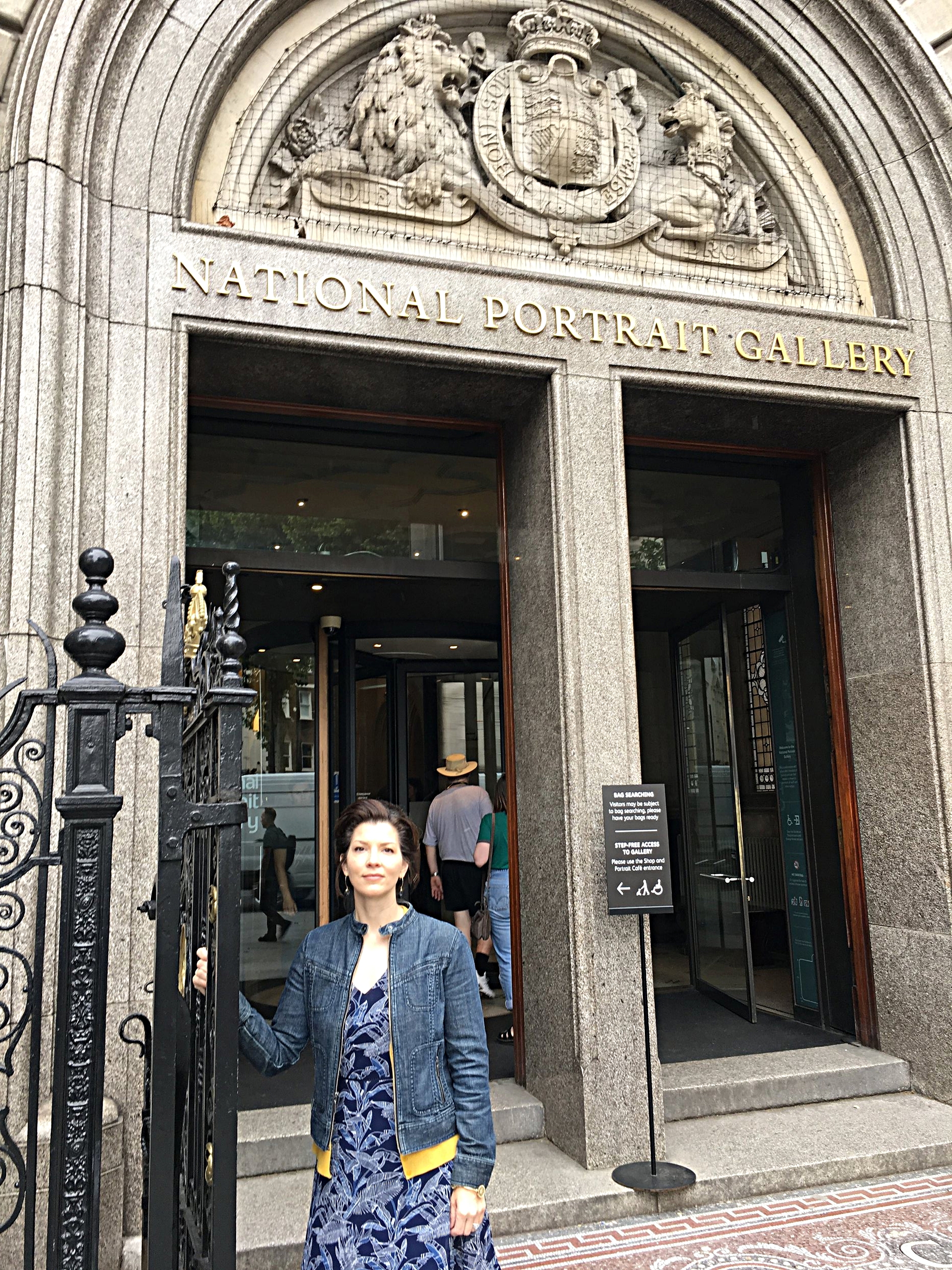
Of course, I had to seek out the National Portrait Gallery when I was in London! I’ve always been drawn to original art and portraits in all art forms; Ed Sheeran’s portrait by Colin Davidson is stunning in it’s depth of detail. The London art scene is quite incredible!
